
Wednesday 27 April 2011
Production Schedule for Music Magazine Production - 25/04/2011
This is the production schedule logging the production of my music magazine:

Friday 22 April 2011
My Finished Products - 22/04/2011
I have finally completed my music magazine. My finished front page looks like this:


And my finished contents page looks like this:

Lastly, my completed double page spread looks like this:

Monday 18 April 2011
Progress So Far (Music Magazine Double Page Spread) - 18/04/2011
Before I started modifying my double page spread today, it looked like this:


And my completed spread looked like this:

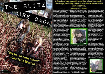
I first drew a text box using the 'Horizontal Type Tool' and typed the quote '"We hated each other!" - Charlotte Westall' into it in the font Myriad Pro, Bold, size 36pt, Strong, alligned to the centre of its text box and yellow in colour. I then wrote three more captions on my spread and made them in the same front, Condensed, size 14pt, Strong and white and green in colour. I placed these captions over my three images. Lastly, I drew black rectangles using the 'Rectangle Tool' and placed them behind these captions to make them stand out from the three images.
Sunday 17 April 2011
Progress So Far (Music Magazine Double Page Spread) - 17/04/2011
At the start of the day, my double page spread looked like this:


But by the end of the day, it looked like this:
I wrote my magazine article on Microsoft Word and copied and pasted it onto my double page spread into my columns. The font was Myriad Pro, size 12pt, Strong and white in colour. I then drew another text box using the 'Horizontal Type Tool' and wrote my opening paragraph in yellow at the top of the page, in the font Myriad Pro, Bold, size 22pt, Strong, yellow in colour and alligned to the centre of its text box. I made the "Article by Victoria Dunn" text italic.
Saturday 16 April 2011
Progress So Far (Music Magazine Double Page Spread) - 16/04/2011
Now that I had edited the images that were going to be used in my double page spread, I could actually start creating it. By the end of the day, my double page spread looked like this:


I placed the two shot of Emily Oakes (brunette girl) and Charlotte Westall on the left-hand side of the page, and then used the 'Rectangle Tool' to draw a large black background on the right-hand side. Next, I used the 'Line Tool' to draw to long white lines separating the page into three columns, then placed the other two images of Charlotte and Emily into the second and third columns. Lastly, I again used the 'Rectangle Tool' to draw two green rectangles and place them behind these images, making them stand out from the black backgraound.
Friday 15 April 2011
Progress So Far (Music Magazine Double Page Spread) - 15/04/2011
The last component I need to create for my music magazine is the double page spread on my fictional band 'The Blitz'. Firstly, I needed to edit the images that were going to appear on this spread. Before I modified my first image, it looked like this:


I first used the 'Burn Tool' around Charlotte Westall's (blonde girl on the left) eyes to give her an eyeliner effect to match that of Emily Oakes', and further used the 'Sharpen Tool' on both of their eyes to make them stand out more from the rest of their faces. I then used the 'Ploygonal Lasso Tool' and cut around the top of the reddy-brown bush branches and Emily's head so that I could later bring her head in front of the "THE BLITZ ARE BACK" title. To create this title, I went on http://www.dafont.com/ and downloaded this text and writing my title into it. I placed it on top of the image, and rotated it accordingly. Lastly, I adjusted the placement of the photoshop layers to bring Emily's head in front of the title.


I first used the 'Crop Tool' to crop the image down to this medium shot size. Next, I used the 'Burn Tool' around Charlotte's eyes to give them an eyeliner effect, and the 'Sharpen Tool' to make her eyes contrast against the rest of the image. This image was darker in comparison to my first image, so I modified the 'Brightness/Contrast' to make it match in brightness to my first image.


But afterwards, it looked like this:

I first used the 'Burn Tool' around Charlotte Westall's (blonde girl on the left) eyes to give her an eyeliner effect to match that of Emily Oakes', and further used the 'Sharpen Tool' on both of their eyes to make them stand out more from the rest of their faces. I then used the 'Ploygonal Lasso Tool' and cut around the top of the reddy-brown bush branches and Emily's head so that I could later bring her head in front of the "THE BLITZ ARE BACK" title. To create this title, I went on http://www.dafont.com/ and downloaded this text and writing my title into it. I placed it on top of the image, and rotated it accordingly. Lastly, I adjusted the placement of the photoshop layers to bring Emily's head in front of the title.
My second image looked like this before I modified it:

And after half an hour, it looked like this:

I first used the 'Crop Tool' to crop the image down to this medium shot size. Next, I used the 'Burn Tool' around Charlotte's eyes to give them an eyeliner effect, and the 'Sharpen Tool' to make her eyes contrast against the rest of the image. This image was darker in comparison to my first image, so I modified the 'Brightness/Contrast' to make it match in brightness to my first image.
My last image looked like this before I edited it:

But afterwards, it looked like this:

I used the 'Crop Tool' again to make the image smaller, and then used the 'Sharpen Tool' on her eyes to make them contrast more against the rest of her face. But apart from that, I didn't edit anything else.
Wednesday 13 April 2011
Progress So Far (Music Magazine Contents Page) - 13/04/2011
I managed to complete my contents page today - at the start of the day, it looked like this:


My completed version looked like this:

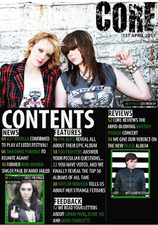
Firstly, I placed a smaller image of the front cover of my music magazine in the top left-hand corner to use as a promotion for buying a subscription to CORE. I then used the 'Horizontal Type Tool' to draw a text box and write "GET CORE DELIVERED DIRECTLY TO YOU FOR ONLY £5 PER MONTH! CALL 0151 563 2309 NOW" in the font Myriad Pro, Bold, 20pt, Strong, alligned to the left of its text box and black in colour. After that, I used the 'Rectangle Tool' to draw yellow rectangles behind this promotion to make it stand out from the rest of the page. Next, I drew another text box and typed "TURN TO PAGE 60 FOR A CHANCE TO WIN TWO TICKETS TO SEE GREEN DAY LIVE!" in the same font, size and colour and placed yellow rectangles behind the text again to make it stand out - but this time, I also drew a white rectangle and placed it behind the word "WIN" to make it stand out from the other text and draw the readers eye when they see a chance to win tickets for free.
Tuesday 12 April 2011
Progress So Far (Music Magazine Contents Page) - 12/04/2011
At the start of the afternoon, my contents page looked like this:


But by the end of the day, it looked like this:
I had not changed much during this short period of time, apart from adding captions onto the pictures to distinguish which band/singer is in each one. I drew a text box over each picture using the 'Horizontal Type Tool' and typed the caption text into it in the font Myriad Pro, Consensed, size 14pt, Strong and alligned to the left of its text box. I made the page numbers yellow, the band names green and the rest of the text white (like I did with the text in the contents columns). This yellow/green/white/black colour scheme corresponds with the colour scheme of the front cover, and thus creates continuity. Lastly, I used the 'Rectangle Tool' to draw black rectangles and place them behind the caption text, making it stand out from the images.
Monday 11 April 2011
Progress So Far (Music Magazine Contents Page) - 11/04/2011
I am still working to complete my music magazine contents page. Before I started modifyign it today, it looked like this:


I first created four subheadings reading "NEWS", "FEATURES", "FEEDBACK" and "REVIEWS" in the font Myriad Pro, Bold Condensed, size 30pt, Strong, black in colour and alligned to the left of its text box using the 'Horiztontal Type Tool'. I then used the 'Rectangle Tool' to draw white rectangles and place them behing these subheadings, thus making them stand out from the page. Next, I used the 'Horizontal Type Tool' again to draw text boxes under each subheading and typed the contents into them in the font Myriad Pro, Condensed, size 20pt and alligned to the left of its text box. I made the page numbers yellow, the band names in green and the rest of the text white. The band names needed to stand out and catch the readers interest, so the green help them to do so.

But by the end of today, it looked like this:

I first created four subheadings reading "NEWS", "FEATURES", "FEEDBACK" and "REVIEWS" in the font Myriad Pro, Bold Condensed, size 30pt, Strong, black in colour and alligned to the left of its text box using the 'Horiztontal Type Tool'. I then used the 'Rectangle Tool' to draw white rectangles and place them behing these subheadings, thus making them stand out from the page. Next, I used the 'Horizontal Type Tool' again to draw text boxes under each subheading and typed the contents into them in the font Myriad Pro, Condensed, size 20pt and alligned to the left of its text box. I made the page numbers yellow, the band names in green and the rest of the text white. The band names needed to stand out and catch the readers interest, so the green help them to do so.
Sunday 10 April 2011
Progress So Far (Music Magazine Contents Page) - 10/04/2011
Now that I've edited the images that are going to be used in my contents page, I can start putting it together. After a few hours, my contents page looked like this:

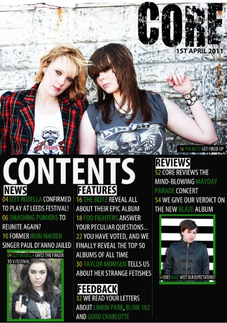
Firstly, I placed the image of Charlotte Westall and Emily Oakes across the top half of the page and put the "CORE" heading over it in the top right-hand corner, and out the date underneath it so it corresponds to the front cover. I then used the 'Rectangle Tool' to create the black background on the bottom hallf of the page, and further used the 'Line Tool' to draw white lines diving the page up into three columns. I then drew a text box using the 'Horizontal Type Tool' and typed "CONTENTS" in the font Myriad Pro, Bold Condensed, size 100pt, Strong and white in colour and alligned to the left of its text box. Next, I placed the images of Lucy Rimmer-Hall and Conor Wynn into the left and right-hand columns and resized them to fit into the space. To make these pictures stand out more from the page, I drew green rectangles using the 'Rectangle Tool' and placed them behind the images.

Firstly, I placed the image of Charlotte Westall and Emily Oakes across the top half of the page and put the "CORE" heading over it in the top right-hand corner, and out the date underneath it so it corresponds to the front cover. I then used the 'Rectangle Tool' to create the black background on the bottom hallf of the page, and further used the 'Line Tool' to draw white lines diving the page up into three columns. I then drew a text box using the 'Horizontal Type Tool' and typed "CONTENTS" in the font Myriad Pro, Bold Condensed, size 100pt, Strong and white in colour and alligned to the left of its text box. Next, I placed the images of Lucy Rimmer-Hall and Conor Wynn into the left and right-hand columns and resized them to fit into the space. To make these pictures stand out more from the page, I drew green rectangles using the 'Rectangle Tool' and placed them behind the images.
Saturday 9 April 2011
Progress So Far (Music Magazine Contents Page) - 09/04/2011
Today, I edited the three images that are going to be used on my contents page using photoshop. My first original images looked like this:


I first used the 'Vibrance' effect to make the image darker, and then drew around the eyes using the 'Polygonal Lasso Tool'. I then used the 'Hue/Saturation' effect to make her eyes green and brighter, therefore causing them to stand out from the rest of the darker image.

But I transformed it into this:

Firstly, I used the 'Clone Stamp Tool' to cover up a strand of hair that was falling across Emily Oakes' (brunette girl's) cheek, as I felt that it obstructed the full effect of Emily's face in the shot. Next, I used the 'Burn Tool' around both Charlotte Westall and Emily's eyes to give a shadowed effect, and make the medium shot seem more moody and dark. I then placed an image of a star tatoo over the original photo layer on Emily's wrist, and used the 'Dodge Tool' to make it blend in with Emily's skin. Using the 'Sharpen Tool', I made their eyes look sharper and stand out more, and I also used this tool on Emily's thumb wring to give it a shinier look. Next, I used the 'Colour Replacement Tool' over Charlotte's hair to make it brighter and contrast more against Emily's darker hair tone. Lastly, I used the 'Brightness/Contrast' effect to make the image brighter and more contrasting to match with the edited image used on my music magazine front cover.
The second image I edited for my contents page originally looked like this:

But after I finished editing it, my image looked like this:

Firstly, I used the 'Crop Tool' to cut half of the image off and make the remaining half larger. I then used the 'Sharpen Tool' on Conor Wynn to make his eyes sharper and stand out more from the rest of his face. Next, I used the 'Polygonal Lasso Tool' to draw around Conor's body and cut out the background of the image and used the 'Gradient Tool' to replace it with this black and white striped background. Lastly, I used the 'Drop Shadow' effect to give a shadow to Conor.
The last image for my contents page originally looked like this:

But after modifying, it looked like this:

I first used the 'Vibrance' effect to make the image darker, and then drew around the eyes using the 'Polygonal Lasso Tool'. I then used the 'Hue/Saturation' effect to make her eyes green and brighter, therefore causing them to stand out from the rest of the darker image.
Subscribe to:
Posts (Atom)