
Wednesday 27 April 2011
Production Schedule for Music Magazine Production - 25/04/2011
This is the production schedule logging the production of my music magazine:

Friday 22 April 2011
My Finished Products - 22/04/2011
I have finally completed my music magazine. My finished front page looks like this:


And my finished contents page looks like this:

Lastly, my completed double page spread looks like this:

Monday 18 April 2011
Progress So Far (Music Magazine Double Page Spread) - 18/04/2011
Before I started modifying my double page spread today, it looked like this:


And my completed spread looked like this:

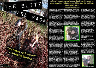
I first drew a text box using the 'Horizontal Type Tool' and typed the quote '"We hated each other!" - Charlotte Westall' into it in the font Myriad Pro, Bold, size 36pt, Strong, alligned to the centre of its text box and yellow in colour. I then wrote three more captions on my spread and made them in the same front, Condensed, size 14pt, Strong and white and green in colour. I placed these captions over my three images. Lastly, I drew black rectangles using the 'Rectangle Tool' and placed them behind these captions to make them stand out from the three images.
Sunday 17 April 2011
Progress So Far (Music Magazine Double Page Spread) - 17/04/2011
At the start of the day, my double page spread looked like this:


But by the end of the day, it looked like this:
I wrote my magazine article on Microsoft Word and copied and pasted it onto my double page spread into my columns. The font was Myriad Pro, size 12pt, Strong and white in colour. I then drew another text box using the 'Horizontal Type Tool' and wrote my opening paragraph in yellow at the top of the page, in the font Myriad Pro, Bold, size 22pt, Strong, yellow in colour and alligned to the centre of its text box. I made the "Article by Victoria Dunn" text italic.
Saturday 16 April 2011
Progress So Far (Music Magazine Double Page Spread) - 16/04/2011
Now that I had edited the images that were going to be used in my double page spread, I could actually start creating it. By the end of the day, my double page spread looked like this:


I placed the two shot of Emily Oakes (brunette girl) and Charlotte Westall on the left-hand side of the page, and then used the 'Rectangle Tool' to draw a large black background on the right-hand side. Next, I used the 'Line Tool' to draw to long white lines separating the page into three columns, then placed the other two images of Charlotte and Emily into the second and third columns. Lastly, I again used the 'Rectangle Tool' to draw two green rectangles and place them behind these images, making them stand out from the black backgraound.
Friday 15 April 2011
Progress So Far (Music Magazine Double Page Spread) - 15/04/2011
The last component I need to create for my music magazine is the double page spread on my fictional band 'The Blitz'. Firstly, I needed to edit the images that were going to appear on this spread. Before I modified my first image, it looked like this:


I first used the 'Burn Tool' around Charlotte Westall's (blonde girl on the left) eyes to give her an eyeliner effect to match that of Emily Oakes', and further used the 'Sharpen Tool' on both of their eyes to make them stand out more from the rest of their faces. I then used the 'Ploygonal Lasso Tool' and cut around the top of the reddy-brown bush branches and Emily's head so that I could later bring her head in front of the "THE BLITZ ARE BACK" title. To create this title, I went on http://www.dafont.com/ and downloaded this text and writing my title into it. I placed it on top of the image, and rotated it accordingly. Lastly, I adjusted the placement of the photoshop layers to bring Emily's head in front of the title.


I first used the 'Crop Tool' to crop the image down to this medium shot size. Next, I used the 'Burn Tool' around Charlotte's eyes to give them an eyeliner effect, and the 'Sharpen Tool' to make her eyes contrast against the rest of the image. This image was darker in comparison to my first image, so I modified the 'Brightness/Contrast' to make it match in brightness to my first image.


But afterwards, it looked like this:

I first used the 'Burn Tool' around Charlotte Westall's (blonde girl on the left) eyes to give her an eyeliner effect to match that of Emily Oakes', and further used the 'Sharpen Tool' on both of their eyes to make them stand out more from the rest of their faces. I then used the 'Ploygonal Lasso Tool' and cut around the top of the reddy-brown bush branches and Emily's head so that I could later bring her head in front of the "THE BLITZ ARE BACK" title. To create this title, I went on http://www.dafont.com/ and downloaded this text and writing my title into it. I placed it on top of the image, and rotated it accordingly. Lastly, I adjusted the placement of the photoshop layers to bring Emily's head in front of the title.
My second image looked like this before I modified it:

And after half an hour, it looked like this:

I first used the 'Crop Tool' to crop the image down to this medium shot size. Next, I used the 'Burn Tool' around Charlotte's eyes to give them an eyeliner effect, and the 'Sharpen Tool' to make her eyes contrast against the rest of the image. This image was darker in comparison to my first image, so I modified the 'Brightness/Contrast' to make it match in brightness to my first image.
My last image looked like this before I edited it:

But afterwards, it looked like this:

I used the 'Crop Tool' again to make the image smaller, and then used the 'Sharpen Tool' on her eyes to make them contrast more against the rest of her face. But apart from that, I didn't edit anything else.
Wednesday 13 April 2011
Progress So Far (Music Magazine Contents Page) - 13/04/2011
I managed to complete my contents page today - at the start of the day, it looked like this:


My completed version looked like this:

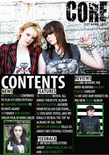
Firstly, I placed a smaller image of the front cover of my music magazine in the top left-hand corner to use as a promotion for buying a subscription to CORE. I then used the 'Horizontal Type Tool' to draw a text box and write "GET CORE DELIVERED DIRECTLY TO YOU FOR ONLY £5 PER MONTH! CALL 0151 563 2309 NOW" in the font Myriad Pro, Bold, 20pt, Strong, alligned to the left of its text box and black in colour. After that, I used the 'Rectangle Tool' to draw yellow rectangles behind this promotion to make it stand out from the rest of the page. Next, I drew another text box and typed "TURN TO PAGE 60 FOR A CHANCE TO WIN TWO TICKETS TO SEE GREEN DAY LIVE!" in the same font, size and colour and placed yellow rectangles behind the text again to make it stand out - but this time, I also drew a white rectangle and placed it behind the word "WIN" to make it stand out from the other text and draw the readers eye when they see a chance to win tickets for free.
Tuesday 12 April 2011
Progress So Far (Music Magazine Contents Page) - 12/04/2011
At the start of the afternoon, my contents page looked like this:


But by the end of the day, it looked like this:
I had not changed much during this short period of time, apart from adding captions onto the pictures to distinguish which band/singer is in each one. I drew a text box over each picture using the 'Horizontal Type Tool' and typed the caption text into it in the font Myriad Pro, Consensed, size 14pt, Strong and alligned to the left of its text box. I made the page numbers yellow, the band names green and the rest of the text white (like I did with the text in the contents columns). This yellow/green/white/black colour scheme corresponds with the colour scheme of the front cover, and thus creates continuity. Lastly, I used the 'Rectangle Tool' to draw black rectangles and place them behind the caption text, making it stand out from the images.
Monday 11 April 2011
Progress So Far (Music Magazine Contents Page) - 11/04/2011
I am still working to complete my music magazine contents page. Before I started modifyign it today, it looked like this:


I first created four subheadings reading "NEWS", "FEATURES", "FEEDBACK" and "REVIEWS" in the font Myriad Pro, Bold Condensed, size 30pt, Strong, black in colour and alligned to the left of its text box using the 'Horiztontal Type Tool'. I then used the 'Rectangle Tool' to draw white rectangles and place them behing these subheadings, thus making them stand out from the page. Next, I used the 'Horizontal Type Tool' again to draw text boxes under each subheading and typed the contents into them in the font Myriad Pro, Condensed, size 20pt and alligned to the left of its text box. I made the page numbers yellow, the band names in green and the rest of the text white. The band names needed to stand out and catch the readers interest, so the green help them to do so.

But by the end of today, it looked like this:

I first created four subheadings reading "NEWS", "FEATURES", "FEEDBACK" and "REVIEWS" in the font Myriad Pro, Bold Condensed, size 30pt, Strong, black in colour and alligned to the left of its text box using the 'Horiztontal Type Tool'. I then used the 'Rectangle Tool' to draw white rectangles and place them behing these subheadings, thus making them stand out from the page. Next, I used the 'Horizontal Type Tool' again to draw text boxes under each subheading and typed the contents into them in the font Myriad Pro, Condensed, size 20pt and alligned to the left of its text box. I made the page numbers yellow, the band names in green and the rest of the text white. The band names needed to stand out and catch the readers interest, so the green help them to do so.
Sunday 10 April 2011
Progress So Far (Music Magazine Contents Page) - 10/04/2011
Now that I've edited the images that are going to be used in my contents page, I can start putting it together. After a few hours, my contents page looked like this:

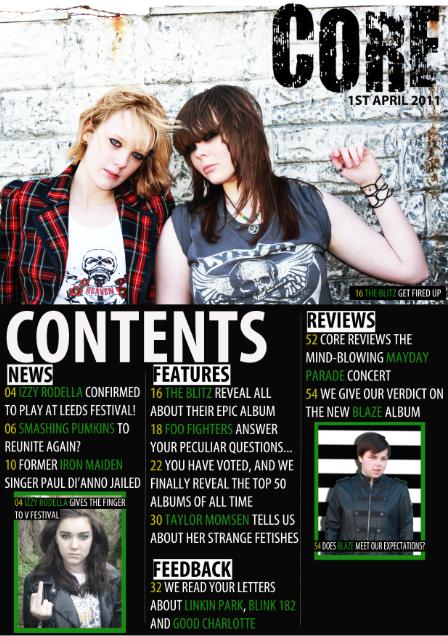
Firstly, I placed the image of Charlotte Westall and Emily Oakes across the top half of the page and put the "CORE" heading over it in the top right-hand corner, and out the date underneath it so it corresponds to the front cover. I then used the 'Rectangle Tool' to create the black background on the bottom hallf of the page, and further used the 'Line Tool' to draw white lines diving the page up into three columns. I then drew a text box using the 'Horizontal Type Tool' and typed "CONTENTS" in the font Myriad Pro, Bold Condensed, size 100pt, Strong and white in colour and alligned to the left of its text box. Next, I placed the images of Lucy Rimmer-Hall and Conor Wynn into the left and right-hand columns and resized them to fit into the space. To make these pictures stand out more from the page, I drew green rectangles using the 'Rectangle Tool' and placed them behind the images.

Firstly, I placed the image of Charlotte Westall and Emily Oakes across the top half of the page and put the "CORE" heading over it in the top right-hand corner, and out the date underneath it so it corresponds to the front cover. I then used the 'Rectangle Tool' to create the black background on the bottom hallf of the page, and further used the 'Line Tool' to draw white lines diving the page up into three columns. I then drew a text box using the 'Horizontal Type Tool' and typed "CONTENTS" in the font Myriad Pro, Bold Condensed, size 100pt, Strong and white in colour and alligned to the left of its text box. Next, I placed the images of Lucy Rimmer-Hall and Conor Wynn into the left and right-hand columns and resized them to fit into the space. To make these pictures stand out more from the page, I drew green rectangles using the 'Rectangle Tool' and placed them behind the images.
Saturday 9 April 2011
Progress So Far (Music Magazine Contents Page) - 09/04/2011
Today, I edited the three images that are going to be used on my contents page using photoshop. My first original images looked like this:


I first used the 'Vibrance' effect to make the image darker, and then drew around the eyes using the 'Polygonal Lasso Tool'. I then used the 'Hue/Saturation' effect to make her eyes green and brighter, therefore causing them to stand out from the rest of the darker image.

But I transformed it into this:

Firstly, I used the 'Clone Stamp Tool' to cover up a strand of hair that was falling across Emily Oakes' (brunette girl's) cheek, as I felt that it obstructed the full effect of Emily's face in the shot. Next, I used the 'Burn Tool' around both Charlotte Westall and Emily's eyes to give a shadowed effect, and make the medium shot seem more moody and dark. I then placed an image of a star tatoo over the original photo layer on Emily's wrist, and used the 'Dodge Tool' to make it blend in with Emily's skin. Using the 'Sharpen Tool', I made their eyes look sharper and stand out more, and I also used this tool on Emily's thumb wring to give it a shinier look. Next, I used the 'Colour Replacement Tool' over Charlotte's hair to make it brighter and contrast more against Emily's darker hair tone. Lastly, I used the 'Brightness/Contrast' effect to make the image brighter and more contrasting to match with the edited image used on my music magazine front cover.
The second image I edited for my contents page originally looked like this:

But after I finished editing it, my image looked like this:

Firstly, I used the 'Crop Tool' to cut half of the image off and make the remaining half larger. I then used the 'Sharpen Tool' on Conor Wynn to make his eyes sharper and stand out more from the rest of his face. Next, I used the 'Polygonal Lasso Tool' to draw around Conor's body and cut out the background of the image and used the 'Gradient Tool' to replace it with this black and white striped background. Lastly, I used the 'Drop Shadow' effect to give a shadow to Conor.
The last image for my contents page originally looked like this:

But after modifying, it looked like this:

I first used the 'Vibrance' effect to make the image darker, and then drew around the eyes using the 'Polygonal Lasso Tool'. I then used the 'Hue/Saturation' effect to make her eyes green and brighter, therefore causing them to stand out from the rest of the darker image.
Sunday 27 March 2011
Progress So Far (Music Magazine Front Cover) - 27/03/2011
By the end of this 2 hour lesson, I aimed to fully complete the CORE magazine front cover - and I completed this task. Before the lesson, my front cover looked like this:


But after 2 hours, my completed version looked like this:

As you can see, I added on more pugs and a promotion to act as enticing features for the front cover of CORE. Firstly, I used the 'Horizontal Type Tool' and drew text boxes on the right-hand side of the page, writing "GREATEST ALBUMS OF ALL TIME/YOU HAVE VOTED, AND NOW WE REVEAL ALL" in the first box, "FOO FIGHTERS/ANSWER YOUR QUESTIONS" in the second and "THE PRETTY RECKLESS/ TAYLOR MOMSEN TALKS GUNS, KNIVES AND STRIPPER OUTFITS" into the third. All of this text was in the font Myriad Pro, Bold Condensed, 80pt, Strong and alligned to the left of the text boxes. However, the descriptions underneath the subtubles in each pug was a smaller 65pt and in yellow, to mark a difference between the subtitle and the description. These pugs aim to give an insight into the other articles featured in the magazine, and use emotive language such as "GREATEST" and dangerous/hardcore words such as "GUNS" and "KNIVES" to do so. Next, I decided to use a promotion on the magazine cover to entice the reader into buying CORE for the free gifts it has to offer. I drew a text box using the 'Horizontal Type Tool' and wrote "POSTER SPECIAL/10 POSTERS OF OUR FAVOURITE ROCK BANDS" into it. The main subtitle was in the font Myriad Pro, Bold Condensed, size 100pt, Strong, alligned to the centre of the text box and in the colour green, whilst the description underneath was the same apart from it being in the size 25pt and the colour yellow. Lastly, I used the 'Rectangle Tool' to draw black rectangles and place them behind all of the text I had just created, and make it stand out more from the image of The Blitz.
Friday 25 March 2011
Progress So Far (Music Magazine Front Cover) - 25/03/2011
I set myself the objective of adding more puffs and a barcode by the end of todays lessons. Before I started editing the front cover, it looked like this:


But by the end of the 2 hour lesson, my front cover of CORE looked like this:

Firstly, I used the 'Ellipse Tool' to draw a circle, and I then clicked on the 'Set Foreground Colour' button to change the colour to yellow (the colour scheme of my text is green, white, yellow and black). I then used the 'Horizontal Type Tool' to draw a text box, and then type "EXCLUSIVE!" into it - I modified the text so it was in the font Myriad Pro, Bold Condensed Italic, size 90 pt, Strong, alligned to the centre of the text box and black in colour. This "EXCLUSIVE!" text acting as a puff shows how the interview with The Blitz is only goign to be seen in my CORE magazine, and therefore entices readers into wanting to read more about this exclusive interview. Next, I again used the 'Horizontal Type Tool' to draw a text box and type "PLUS! BLINK 182, GREEN DAY, EVANESCENCE AND LINKIN PARK" into it. I then editied this text so it was in the font Myriad Pro, Condensed, size 72pt, Strong and white in colour and alligned to the left of the text box. I wanted the "PLUS!" to stand out and attract the eye of the reader, so I used the 'Rectangle Tool' to draw a yellow rectangle and placed it beneath the text. This text acts as a pug, and gives the reader an insight into what other well-known bands will be discussed in my magazine and entice them into reading the whole magazine. Lastly, I went on ww.google.com and found an image of a barcode. I copied this barcode onto my front cover and placed it in the bottom right-hand corner of the page, and used the 'Horizontal Type Tool' to type the magazine price, "£3.99", into it. I then used the 'Rectangle Tool' again to draw a white rectangle, and placed it below the barcode and underneath the price to make it look as though it's attatched to the barcode.
Wednesday 23 March 2011
Progress So Far (Music Magazine Front Cover) - 23/03/2011
Now that I had completed my masthead, I needed to add on the pugs and puffs to entice readers into purchasing my music magazine CORE. Before I started editing the front cover, it looked like this:

After 1 hour, it looked like this:


After 1 hour, it looked like this:

I've added on text relating to the image, and used language that will entice the reader into purchasing the magazine to read the whole interview. Firstly, I used the 'Horizontal Type Tool' to draw a text box, and I then typed "THE BLITZ" and "THE BLITZ ARE BACK IN ACTION, AND THEY HAVE A CHAT WITH CORE ABOUT THEIR NEW SCREAM-WORTHY ALBUM". This text was in the font Myriad Pro, Bold Condensed, Strong and alligned to the left of the text box. The subtitle was in size 225pt, whilst the description underneath was in size 72pt. I changed the colour of the subtitle "THE BLITZ" by clicking on the 'Set Foreground Colour' button in the left-hand tool bar, and changed it to green. I used the same method for changing the rest of the text white. I decided to then add a shadow onto the subtitle to make it stand out more and give it more depth, so I clicked on the 'FX' tab and added a 'Drop Shadow' to it. I further made the subtitle stand out by using the 'FX' tab and adding a 'Inner Glow', which again gave the text more depth. After editing all this text, I still felt like it didn't really stand out from the image and wouldn't be very noticable to read when sitting on a shelf in a shop, so I clicked on the 'Rectangle Tool' and made black rectangles behind the white text, and white rectangles behind the green text to make it contrast against the image and be more noticable when reading.
Tuesday 22 March 2011
Progress So Far (Music Magazine Front Cover) - 22/03/2011
I had finished editing the image that is going to be used on the front cover of my music magazine in the previous blog post, and now I am ready to start putting together the finished product. Before I started putting it together, my front cover looked like this:


I downloaded the font from http://www.dafont.com/, and then print-screened it onto my front cover. I decided to call the magazine CORE - it is a play on the word 'hardcore' and relates to the hardcore rock/alternative rock/punk genre of my magazine. The heading originially looked like this:

I used the 'Magic Wand Tool' and clicked on the black parts of the heading to get rid of the white background. This gave the heading the impression that it had been graffitied onto the wall of the band image, and adds to this hardcore image. Now that my heading was done, I had to create a dateline underneath it to complete my masthead. I used the 'Horizontal Type Tool' to draw a text box under the magazine heading, and then typed "1ST APRIL 2011" into it. I modified the text so it was in the font Myriad Pro, Bold, size 60pt, Strong, alligned to the left of the text box and black in colour. The masthead to the front cover of my music magazine was then complete.

But after 1 hour, my front cover looked like this:

I downloaded the font from http://www.dafont.com/, and then print-screened it onto my front cover. I decided to call the magazine CORE - it is a play on the word 'hardcore' and relates to the hardcore rock/alternative rock/punk genre of my magazine. The heading originially looked like this:
I used the 'Magic Wand Tool' and clicked on the black parts of the heading to get rid of the white background. This gave the heading the impression that it had been graffitied onto the wall of the band image, and adds to this hardcore image. Now that my heading was done, I had to create a dateline underneath it to complete my masthead. I used the 'Horizontal Type Tool' to draw a text box under the magazine heading, and then typed "1ST APRIL 2011" into it. I modified the text so it was in the font Myriad Pro, Bold, size 60pt, Strong, alligned to the left of the text box and black in colour. The masthead to the front cover of my music magazine was then complete.
Friday 18 March 2011
Progress So Far (Music Magazine Front Cover) - 18/03/2011
I have started photoshopping the image that is going to be used on the front cover of my music magazine. The image originally looked like this:

But by the end of the 2 hour lesson, it looked like this:

I made several changes to this image during my 2 hour lesson. Firstly, I used the 'Burn Tool' around Charlotte Westall's (the blonde girl) eyes to make it look like she was wearing eyeliner, because I felt that the image would relate more to my rock genre if both Emily Oakes and Charlotte were wearing eyeliner. Next, I used the 'Clone Stamp Tool' to cover up any shadow marks on their faces, to create a clear image that can be seen fully on the front cover. In the original image the eyes didn't stand out like I had intended them to, so I used the 'Sharpen Tool' over the eyes to make them have a start contrast against the rest of the image. Lastly, I create a 'Brightness/Contrast' layer, and made the image brighter and more contrasting to make the image seem brigter, yet more eerie to match the genre of my magazine.
Tuesday 15 March 2011
Photoshop Practices - 15/03/2011
For this project, I have to use Photoshop to edit the pictures I have taken previously and create a front cover, contents page and double page spread for my music magazine. I have never used Photoshop before commencing this project, so I first need to practice on it using images of the internet. Theses are the two images I edited:


Before

After

As you can see, I have changed a lot about Angelina Jolie's basic natural-looking picture and made her stand out and look very eccentric. Firstly, I used the 'Clone Stamp Tool' to get rid of any blemishes or beauty spots (such as that above her left eyebrow) to make a skin completley clear. I then went on to using the 'Polygonal Lasso Tool' to outline just her hair, and then created a new layer via copy and changed the hue and saturation of the picture to change the colour of her hair to this vivid green colour. After that, I decided to change the colour of her eyes to, so I again used the 'Polygonal Lasso Tool' to outline both of her eyes and again make a new layer via copy. I changed the gradient of her eyes to give her this peculiar yellow/brown tinged eye colour, which made her striking eyes stand out. Next, I used the 'Eliptical Marquee Tool' to draw a circle aroung the lips and create a new layer via copy, and then turned the lips bright pink by altering the hue and saturation again. After all of this, I decided that I would try changing the colour of Angelina's face too, and subsequently used the 'Dodge Tool' all over her face to give it this strange, snow white glow. I then used the same 'Dodge Tool' on her lips, to give them a glistening white glow and make them look more realistic and shiny. I finished my editing off by using the 'Burn Tool' on her bottom eyelids to give her the effect of having eyeliner on.
Before

After

I do not think that this photoshop practice of Eva Longoria was as successful as my last, but it looks more realisitc than the eccentric Angelina Jolie image. I firstly went over her skin with the tool... I then removed any spots and blemishes with the 'Clone Stamp Tool' to give her a more clear and spot-free skin. After that I used the 'Polygonal Lasso Tool' to outline her lips and create a new layer via copy, and change the colour of them by altering the hue and saturation levels. But after doing this Eva's teeth had turned the same nude colour as her lips, so I clicked on the lips layer and used the 'Erasor Tool' to just rub out the overlapping nude colour and expose the real teeth colour underneath. This made the photoshop picture appear more natural. Next I used the 'Burn Tool' to give her the effect of wearing eyeliner on the top and bottom lids of her eyes, and then followed by using the same tool to darken her eyebrows to make them look thicker and stronger. Lastly I decided that I wanted to try changing the background of the image as it seemed quite boring and plain, so I used the 'Polygonal Lasso Tool' to outline just her body and face and create a new layer via copy. I then found an image on google of the lit up city of New York and copied it onto a new layer, and resized it to fit the overlapping image of Eva and make her look like she's in the fantastic city.
Thursday 3 March 2011
Production Schedule for Research and Planning - 03/03/2011
This is the production schedule for my research and planning. It shows how I have been organising my work in order to hand everything in on time.


Wednesday 2 March 2011
Mock Shots - 03/03/2011
These are some of the mock shots that I took during my photoshoot. These pictures did not work out in the way that I had hoped, and I am therefore not going to use them.


This extreme close-up shot of Emily Oakes's eyes was unsuccesful, as it blurred slightly at the edges and pupils and did not look how I had visioned.

I took both medium and long shots of Conor Wynn for my contents page, but I feel that the long shots looked better than the medium shots so I am therefore not using this medium shot photo.

This long shot did not work out in the way I had hoped, as the monkey-frame that Emily Oakes is clinging onto does not fit the overall vibe to my music magazine. Also, half of her face is cast in shadow, which is not what I initially wanted.

This long shot did not work as Emily Oakes is placed too far away from the camera in comparison to Charlotte Westall, and subsequently Emily goes unnoticed in the background.

This long shot of Lucy Rimmer-Hall is unsuccessful since we cannot see the whole of her face - a close-up on her face would be more effective.
Tuesday 1 March 2011
Actor, Costume and Venue Lists - 01/03/2011
Actors
The actors (models) of my photoshoot will be as follows:
The actors (models) of my photoshoot will wear the following outfits:
The venues for my photoshoot are as follows:
The actors (models) of my photoshoot will be as follows:
- Emily Oakes
- Charlotte Westall
- Lucy Rimmer-Hall
- Conor Wynn
The actors (models) of my photoshoot will wear the following outfits:
- Emily Oakes - a grey t-shirt with a white skull on it and the sleves rolled up, a pair of dark jeans and a pair of navy converse
- Charlotte Westall - a white vest top with black skull and red roses on it, a pair of black skinny jeans, a red tartan blazor, grey knee high lace-up boots and (for some shots) black gloves
- Lucy Rimmer-Hall - white patterned t-shirt, black leather jacket, black skinny jeans and black lace-up boots
- Conor Wynn - a black military-style leather jacket, dark jeans and dark brown lace-up boots
The venues for my photoshoot are as follows:
- Glen Park - Maghull
- Outside a garage - Maghull
- Alleyway - Maghull
- Next to Canal - Maghull
Sunday 27 February 2011
Risk Assessment Forms - 27/02/2011
These are the risk assessment forms for the photoshoot of the bands for my music magazine. The forms were necessary to analyse the possible risks of my models in the areas were the pictures were going to be taken, and how I could control these risks from happening.


Subscribe to:
Posts (Atom)