This is the production schedule logging the production of my music magazine:
Victoria Dunn AS Media Studies
Blog for Year 12 Media Studies research
Wednesday 27 April 2011
Friday 22 April 2011
My Finished Products - 22/04/2011
I have finally completed my music magazine. My finished front page looks like this:
And my finished contents page looks like this:
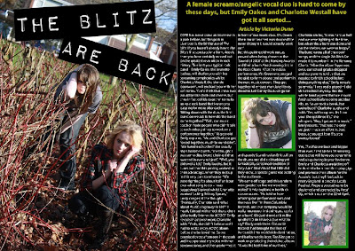
Lastly, my completed double page spread looks like this:
Monday 18 April 2011
Progress So Far (Music Magazine Double Page Spread) - 18/04/2011
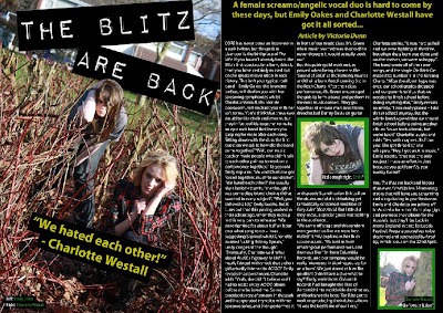
Before I started modifying my double page spread today, it looked like this:
And my completed spread looked like this:
I first drew a text box using the 'Horizontal Type Tool' and typed the quote '"We hated each other!" - Charlotte Westall' into it in the font Myriad Pro, Bold, size 36pt, Strong, alligned to the centre of its text box and yellow in colour. I then wrote three more captions on my spread and made them in the same front, Condensed, size 14pt, Strong and white and green in colour. I placed these captions over my three images. Lastly, I drew black rectangles using the 'Rectangle Tool' and placed them behind these captions to make them stand out from the three images.
Sunday 17 April 2011
Progress So Far (Music Magazine Double Page Spread) - 17/04/2011
At the start of the day, my double page spread looked like this:

But by the end of the day, it looked like this:

I wrote my magazine article on Microsoft Word and copied and pasted it onto my double page spread into my columns. The font was Myriad Pro, size 12pt, Strong and white in colour. I then drew another text box using the 'Horizontal Type Tool' and wrote my opening paragraph in yellow at the top of the page, in the font Myriad Pro, Bold, size 22pt, Strong, yellow in colour and alligned to the centre of its text box. I made the "Article by Victoria Dunn" text italic.
Saturday 16 April 2011
Progress So Far (Music Magazine Double Page Spread) - 16/04/2011
Now that I had edited the images that were going to be used in my double page spread, I could actually start creating it. By the end of the day, my double page spread looked like this:
I placed the two shot of Emily Oakes (brunette girl) and Charlotte Westall on the left-hand side of the page, and then used the 'Rectangle Tool' to draw a large black background on the right-hand side. Next, I used the 'Line Tool' to draw to long white lines separating the page into three columns, then placed the other two images of Charlotte and Emily into the second and third columns. Lastly, I again used the 'Rectangle Tool' to draw two green rectangles and place them behind these images, making them stand out from the black backgraound.
Friday 15 April 2011
Progress So Far (Music Magazine Double Page Spread) - 15/04/2011
The last component I need to create for my music magazine is the double page spread on my fictional band 'The Blitz'. Firstly, I needed to edit the images that were going to appear on this spread. Before I modified my first image, it looked like this:
I first used the 'Burn Tool' around Charlotte Westall's (blonde girl on the left) eyes to give her an eyeliner effect to match that of Emily Oakes', and further used the 'Sharpen Tool' on both of their eyes to make them stand out more from the rest of their faces. I then used the 'Ploygonal Lasso Tool' and cut around the top of the reddy-brown bush branches and Emily's head so that I could later bring her head in front of the "THE BLITZ ARE BACK" title. To create this title, I went on http://www.dafont.com/ and downloaded this text and writing my title into it. I placed it on top of the image, and rotated it accordingly. Lastly, I adjusted the placement of the photoshop layers to bring Emily's head in front of the title.
I first used the 'Crop Tool' to crop the image down to this medium shot size. Next, I used the 'Burn Tool' around Charlotte's eyes to give them an eyeliner effect, and the 'Sharpen Tool' to make her eyes contrast against the rest of the image. This image was darker in comparison to my first image, so I modified the 'Brightness/Contrast' to make it match in brightness to my first image.
But afterwards, it looked like this:
I first used the 'Burn Tool' around Charlotte Westall's (blonde girl on the left) eyes to give her an eyeliner effect to match that of Emily Oakes', and further used the 'Sharpen Tool' on both of their eyes to make them stand out more from the rest of their faces. I then used the 'Ploygonal Lasso Tool' and cut around the top of the reddy-brown bush branches and Emily's head so that I could later bring her head in front of the "THE BLITZ ARE BACK" title. To create this title, I went on http://www.dafont.com/ and downloaded this text and writing my title into it. I placed it on top of the image, and rotated it accordingly. Lastly, I adjusted the placement of the photoshop layers to bring Emily's head in front of the title.
My second image looked like this before I modified it:
And after half an hour, it looked like this:
I first used the 'Crop Tool' to crop the image down to this medium shot size. Next, I used the 'Burn Tool' around Charlotte's eyes to give them an eyeliner effect, and the 'Sharpen Tool' to make her eyes contrast against the rest of the image. This image was darker in comparison to my first image, so I modified the 'Brightness/Contrast' to make it match in brightness to my first image.
My last image looked like this before I edited it:
But afterwards, it looked like this:
I used the 'Crop Tool' again to make the image smaller, and then used the 'Sharpen Tool' on her eyes to make them contrast more against the rest of her face. But apart from that, I didn't edit anything else.
Subscribe to:
Posts (Atom)


